

Finally, we meet! I am Sophie, a brand enthusiast based in Amsterdam. During my studies and internship, I've worked for clients such as Marie Stella Maris, Chupa Chups, Kornuit, Klarna, Stegeman and Sportlife.
To me, brand strategy hits the sweet spot where my passion for creativity, people, trends and analytical thinking meet. It allows me to tackle complex problems while working my creative muscle.
Portfolio


Marie Stella Maris
Consumer Insights · Market Research · Branding · Social Media Advertising · Visual Identity
During my Master at the University of Amsterdam, me and my peers got the opportunity to pitch a new brand extension for Dutch luxury brand Marie Stella Maris. We were able to thrill the Marie Stella Maris marketing team with our ideas, awarding our efforts with a first place out of fifteen teams. The product was launched a few months after.
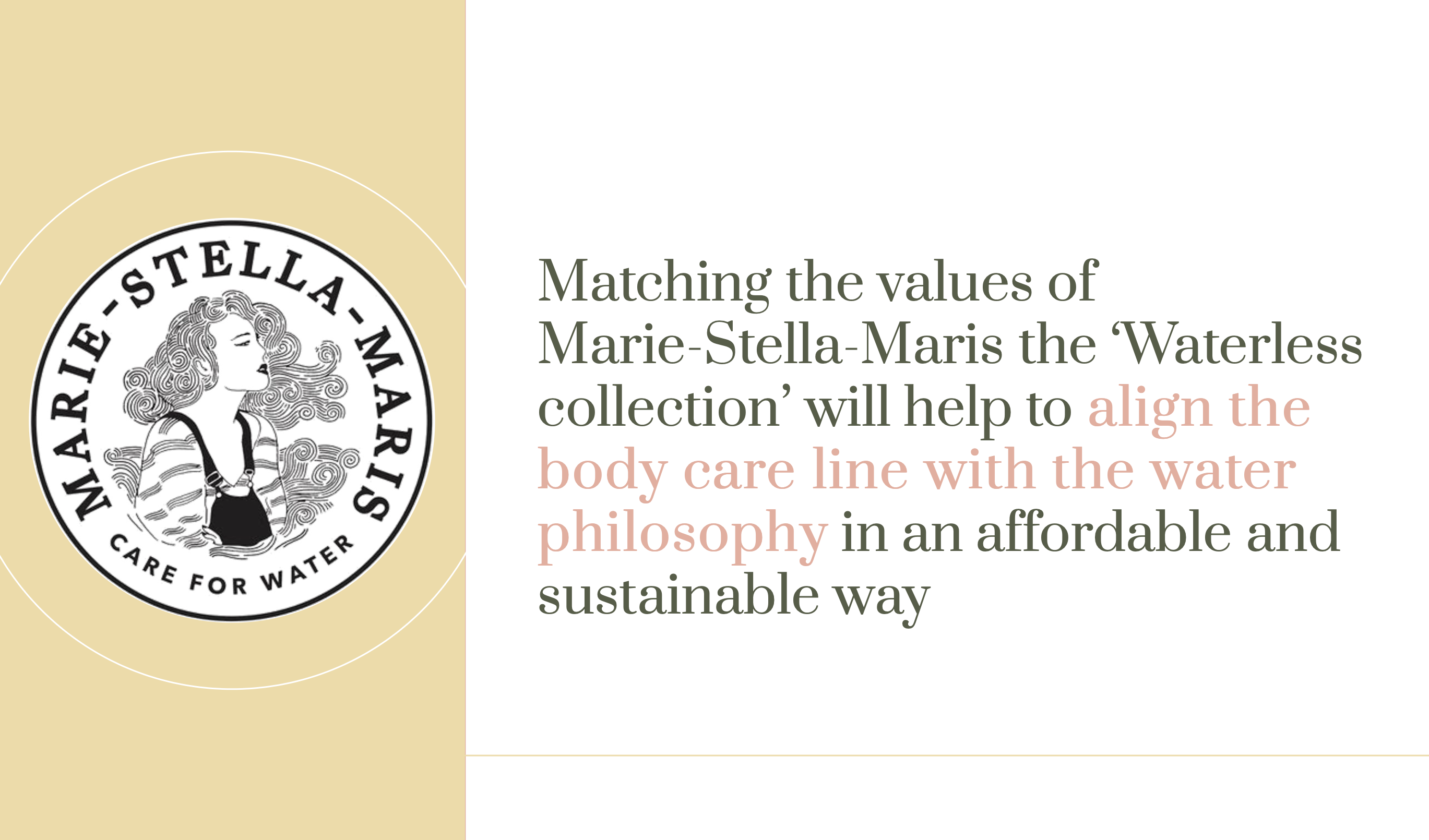
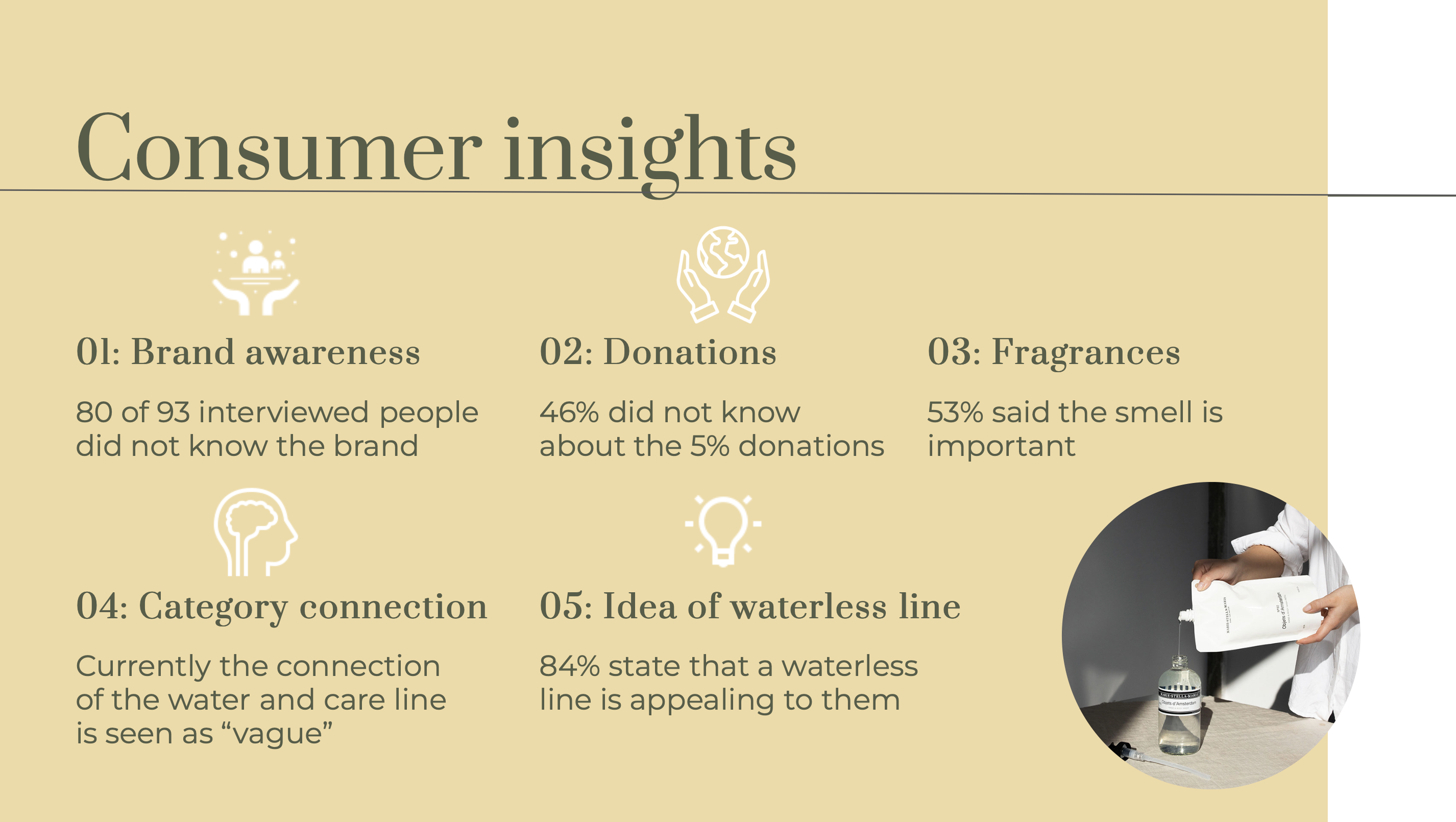
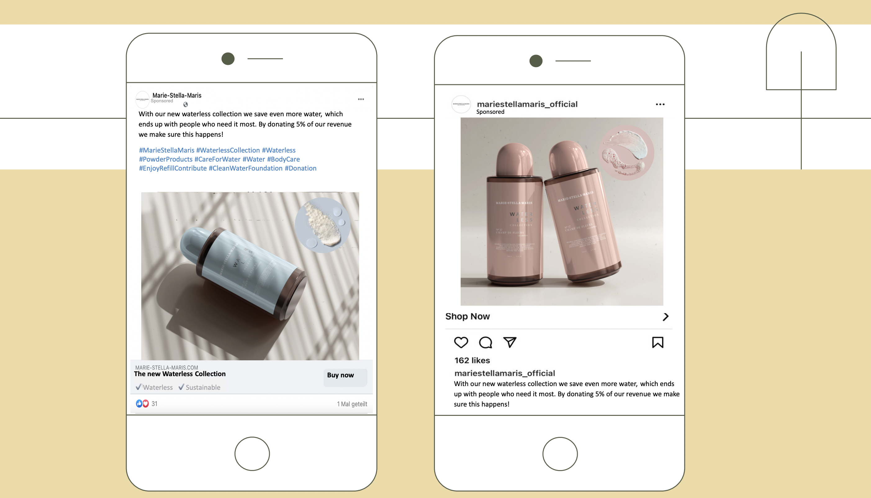
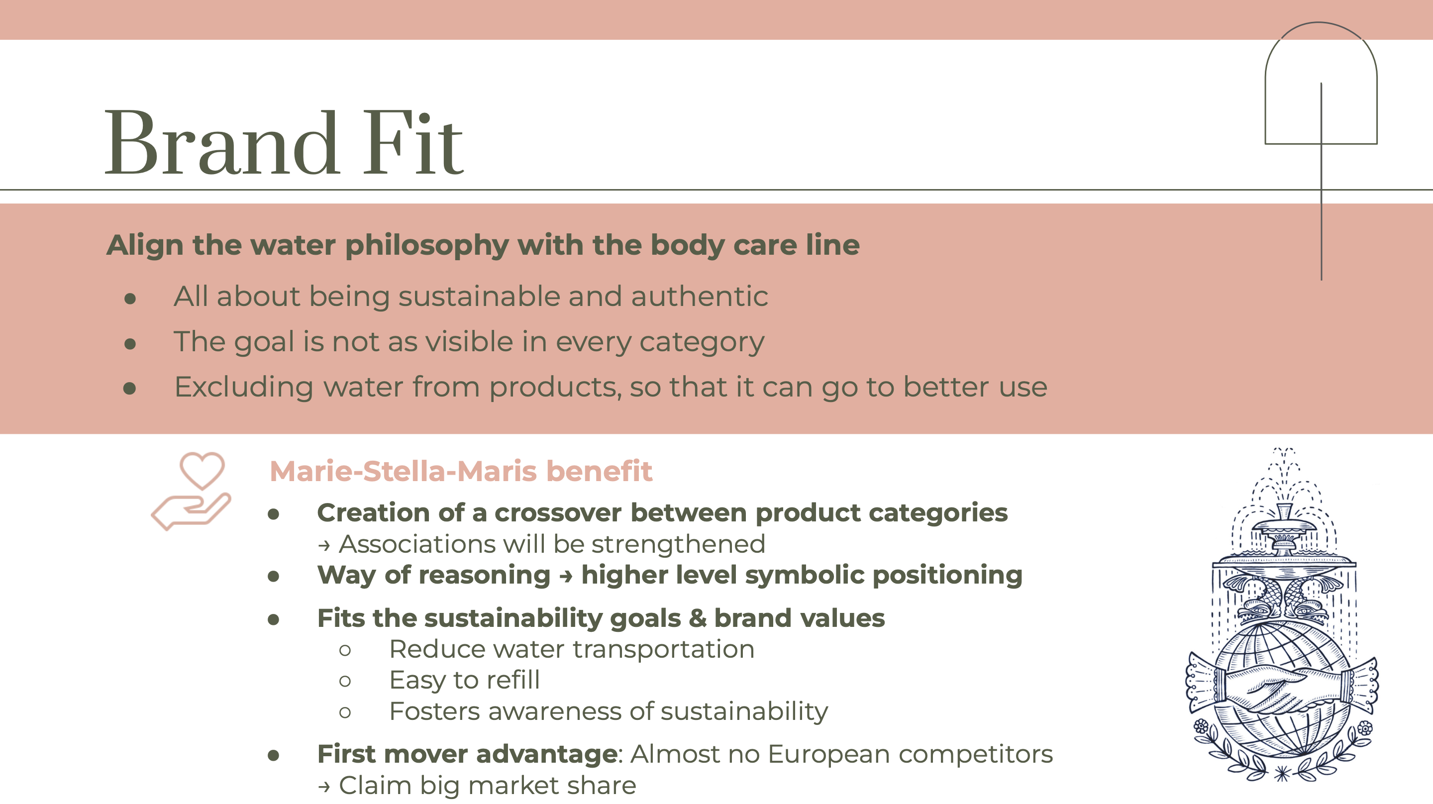
Marie Stella Maris is a brand that aims to provide its customers with premium life essentials. MSM originally started as a bottled water brand, but has since then added toiletries and home fragrances as its main product categories. The brand is strongly connected with these roots, with a mission to provide clean drinking water for everyone. To do so, the brand donates 5% of its turnover to clean water initiatives. However, after conducting thorough interviews with the target audience and customers, we came to the understanding that only 46% was aware of these donations. Also, the connection between the water and toiletries product categories was perceived as vague and confusing. We therefore wanted to create a brand extension that could link these product categories together, as well as MSM's mission.
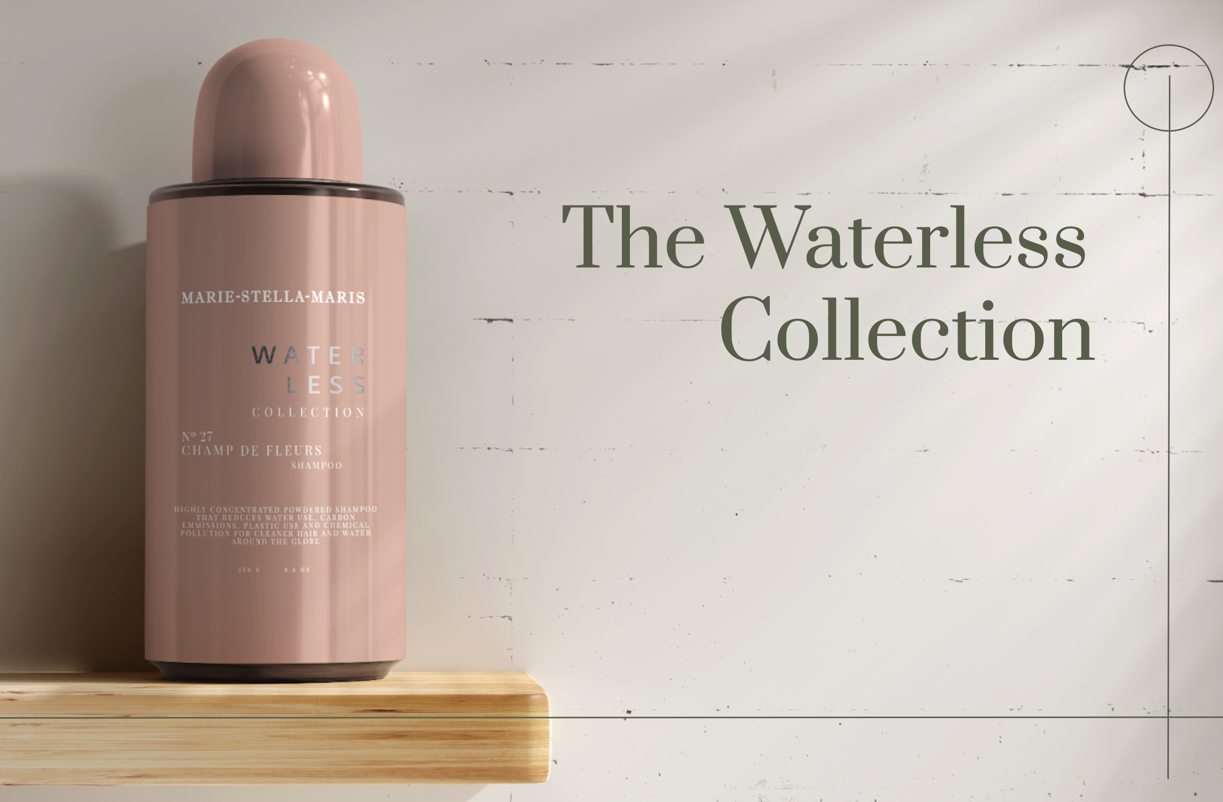
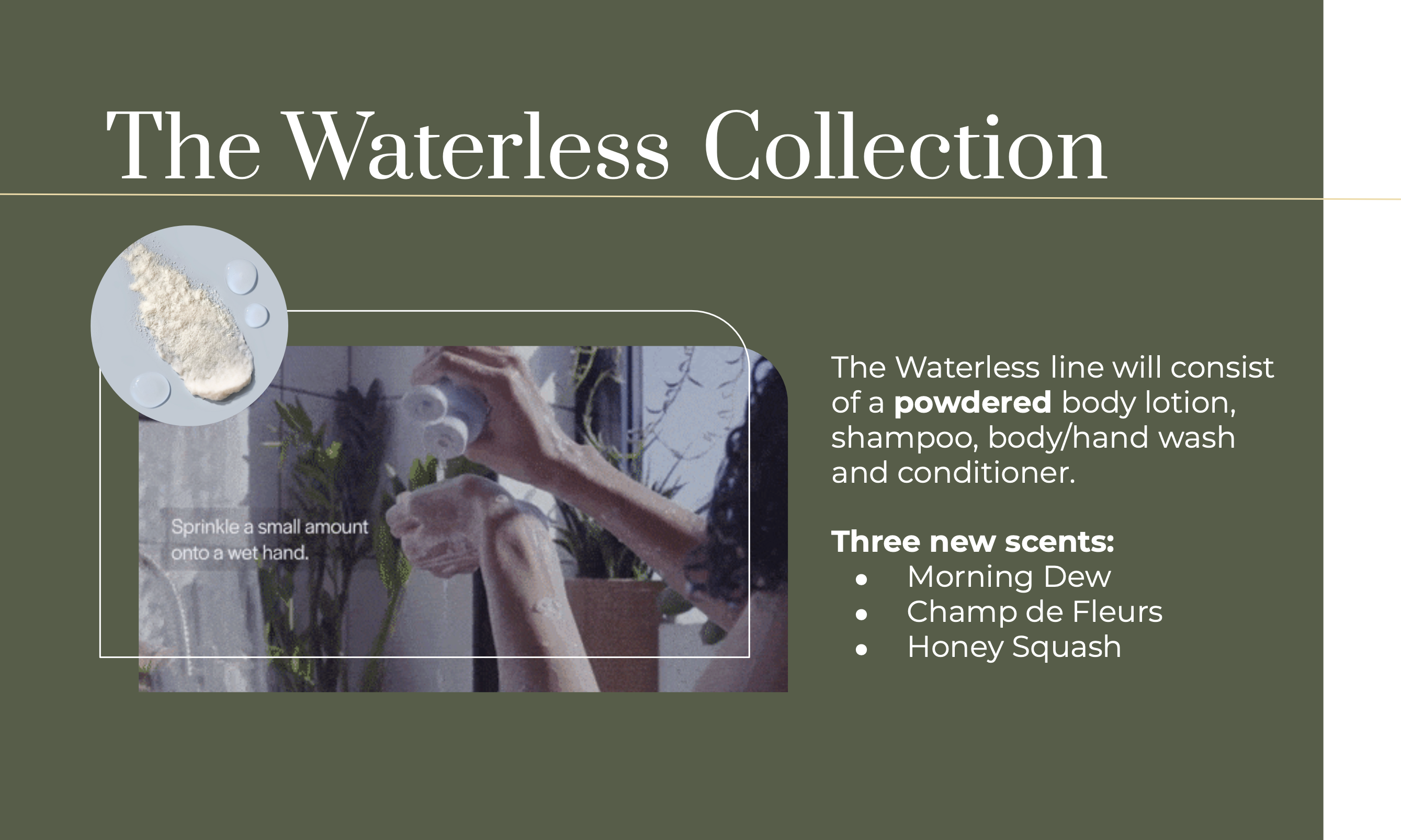
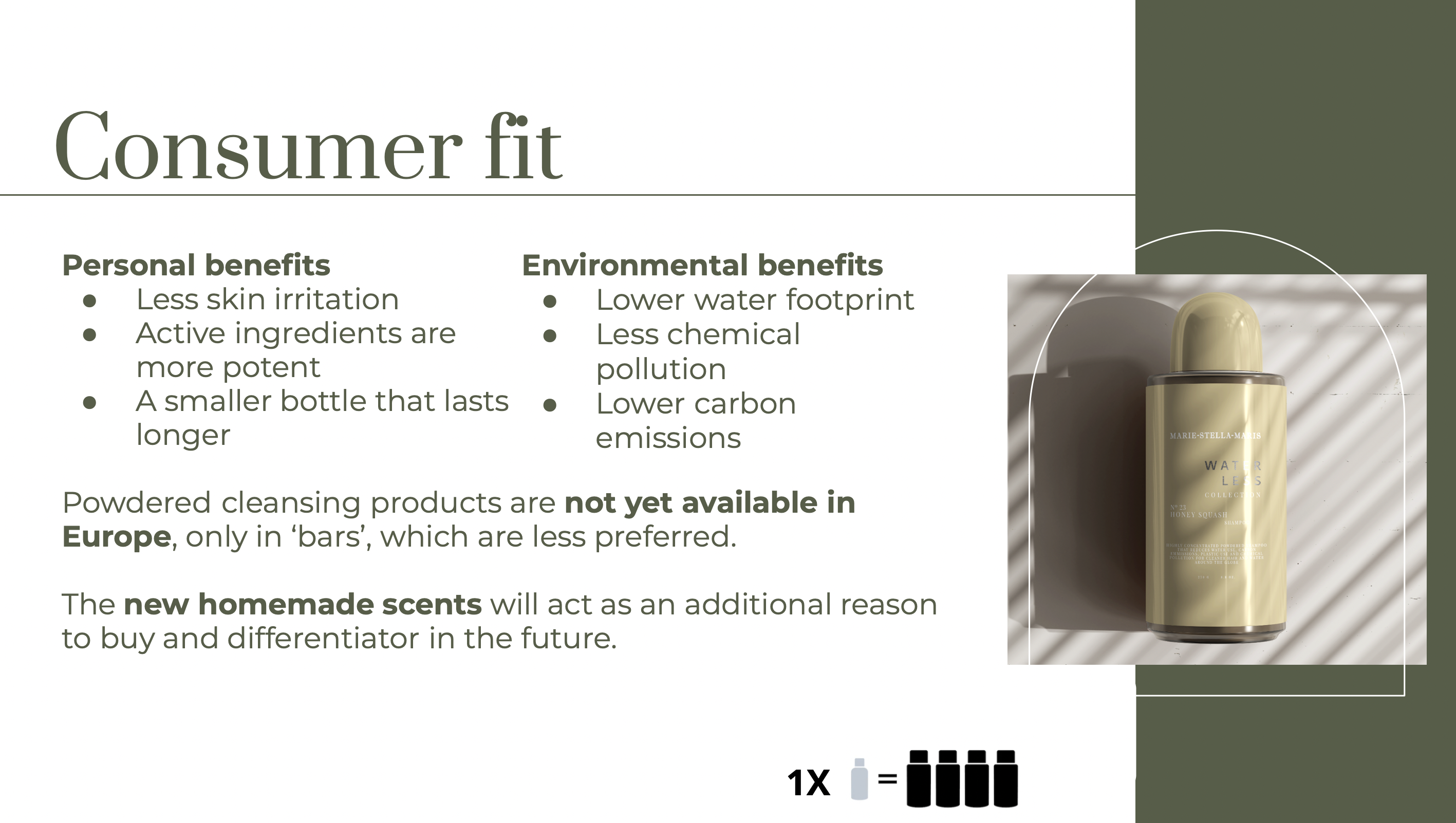
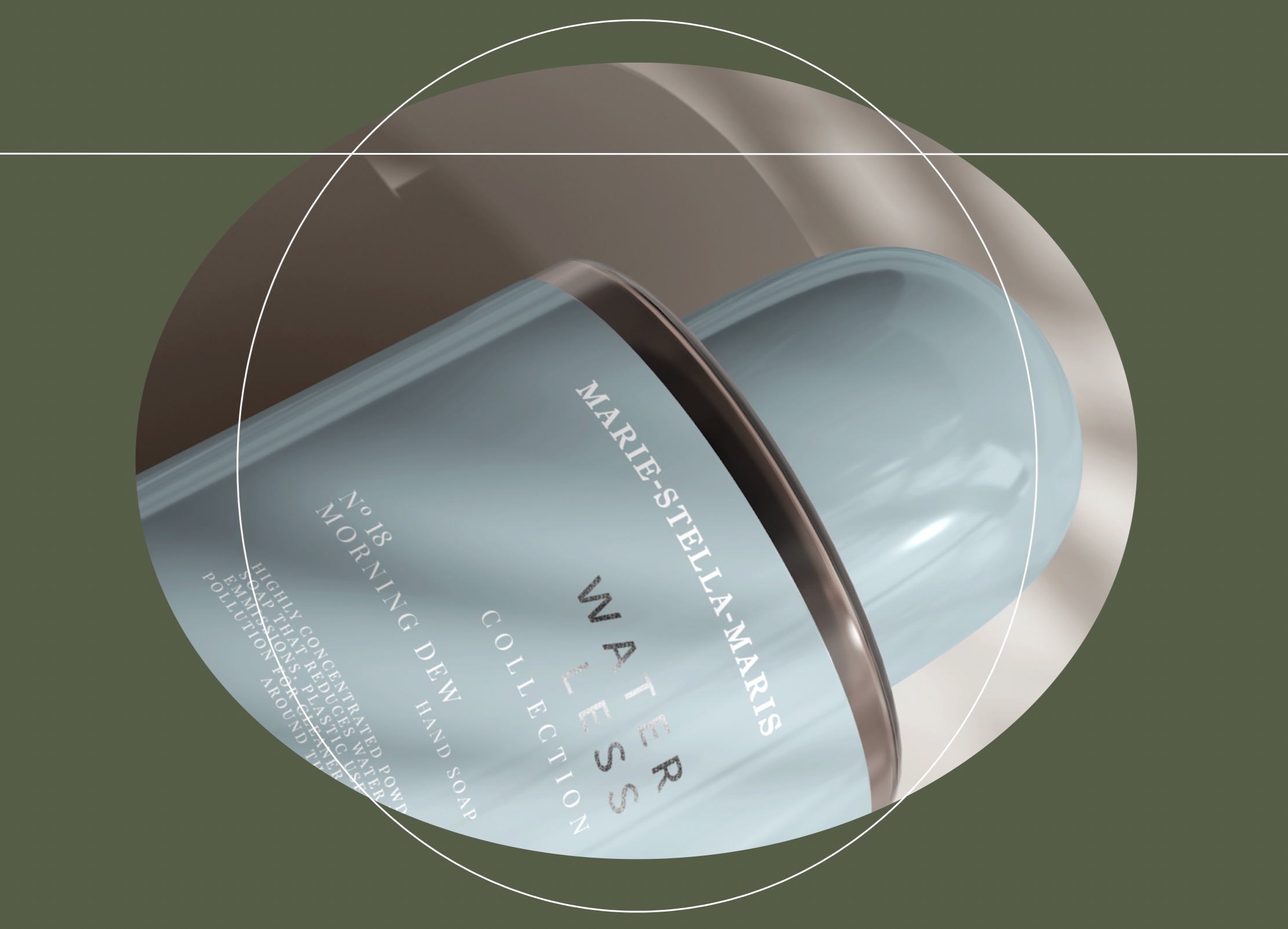
Water makes up about 70-90 percent of your lotions, shampoos and soaps and usually, it is only there to add volume cheaply. So, why not remove it to put that water to better use? I therefore came up with the 'Waterless Collection', a line of powdered body lotion, shampoo, body wash and conditioner with three new fresh scents. Matching the values of Marie-Stella-Maris, the ‘Waterless collection’ will help to align the body care line with the water philosophy in an affordable and sustainable way, creating more powerful and coherent brand associations. The collection also allows MSM to be a first mover and claim big market share, since there is almost no competition in Europe. Additionally, the incongruence of a water company selling a waterless product is a fun element to play with in advertising.
View the presentation here

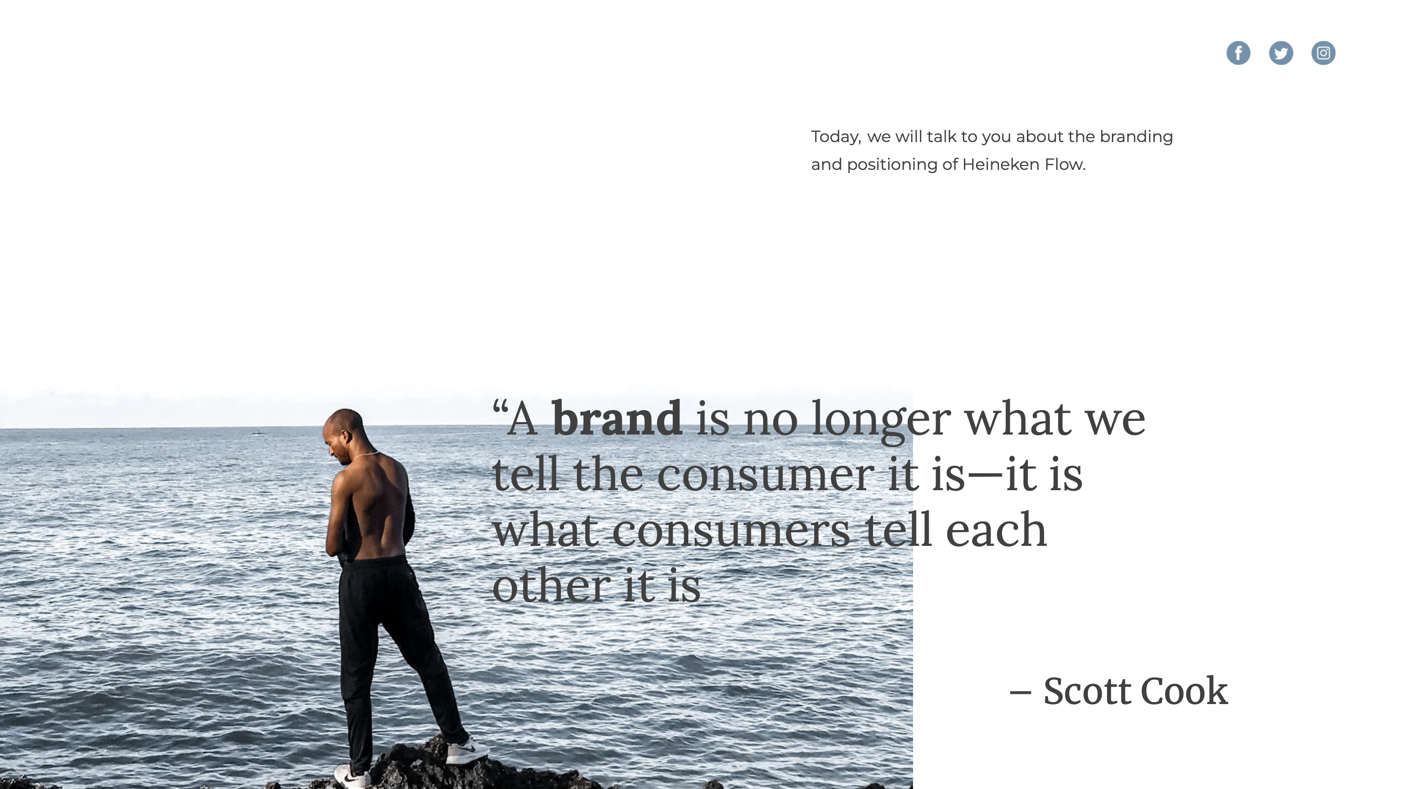

Heineken
Market Research · Branding · Visual Identity
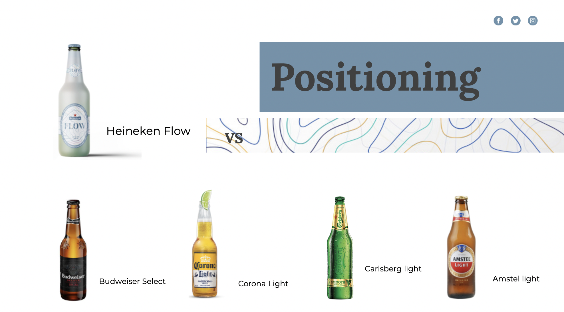
Heineken is a company that has effectively leveraged itself to create an internationally recognised beer and strong brand. Even though Heineken is already one of the worlds leading beverage brands, the company is always looking to tap into new markets. For this fictional pitch, me and my teammates were challenged to come up with a new extension for the brand.
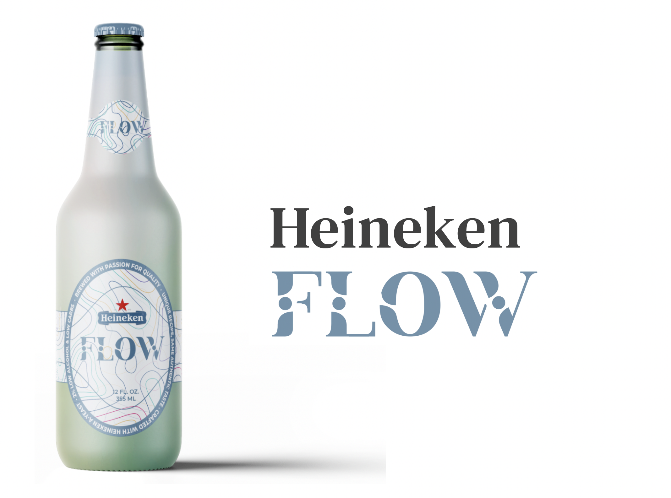
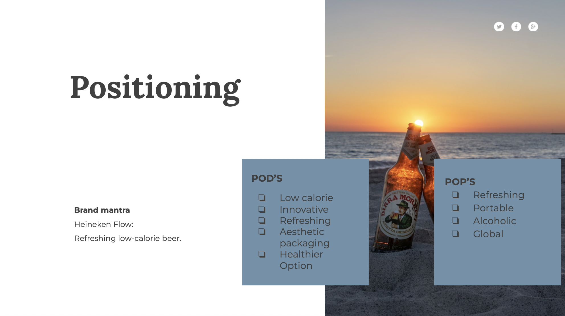
For our extension, we decided to leverage the ever-growing health trend. Our product, 'Heineken Flow', can improve the overall brand image of Heineken by pushing the brand in a healthier, active direction. For a few years now, our society has wanted a healthier way of life and beer has no natural presence in such a lifestyle. Heineken Flow would attract a new target audience, namely the younger and health conscious consumer. Since the Heineken brand name is popular and considered to be trustworthy, it may also increase the interest of current consumers and make them consider Heineken Flow.
Heineken Flow would be launched as a product extension. To ensure the succes of the new extensions positioning, a thorough analysis was carried out to evaluate Heineken Flow's positioning. Among other things, the competitive frame, consumer associations, points of differences and points of parity were studied. A selection of influencers were identified to strengthen secondary associations.
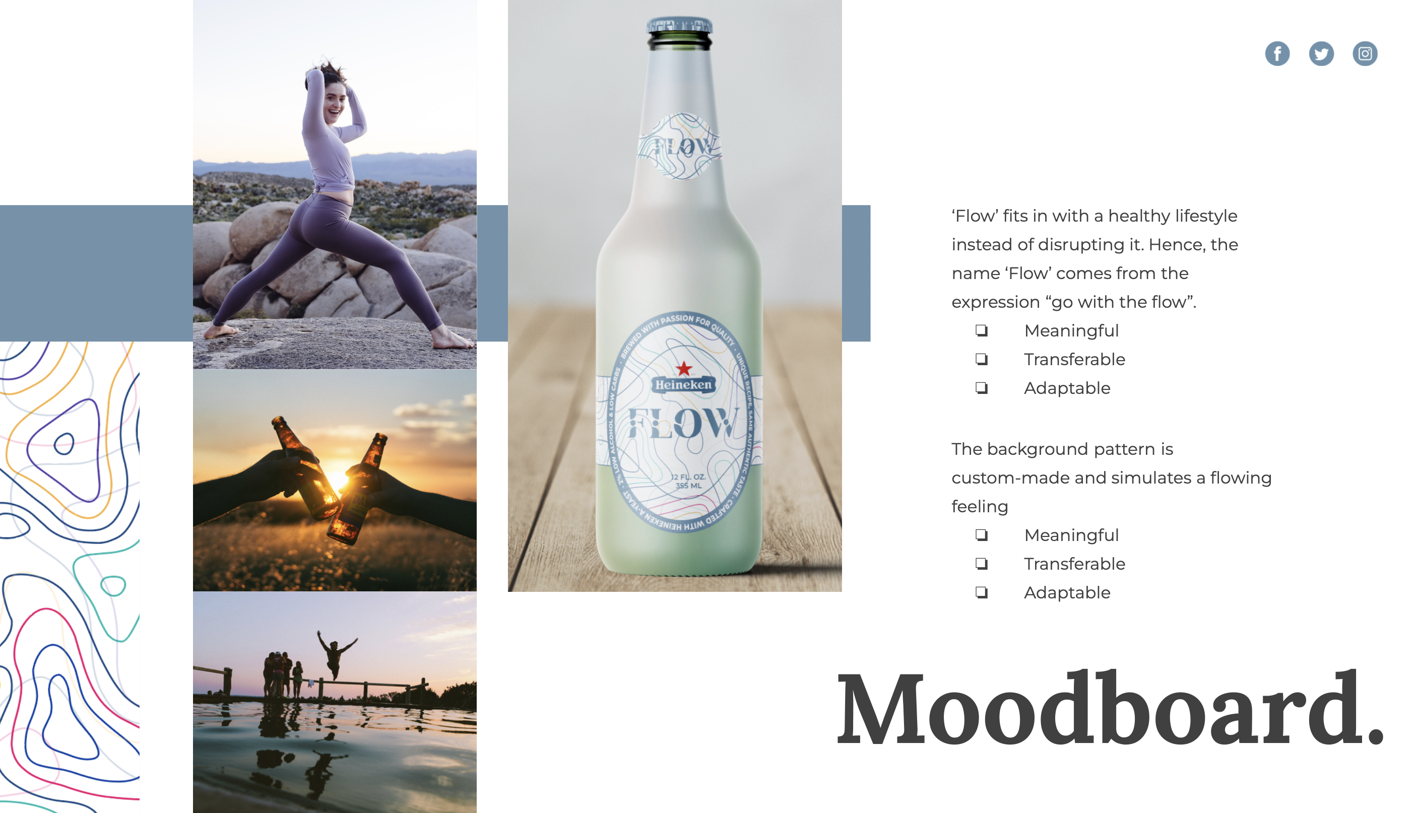
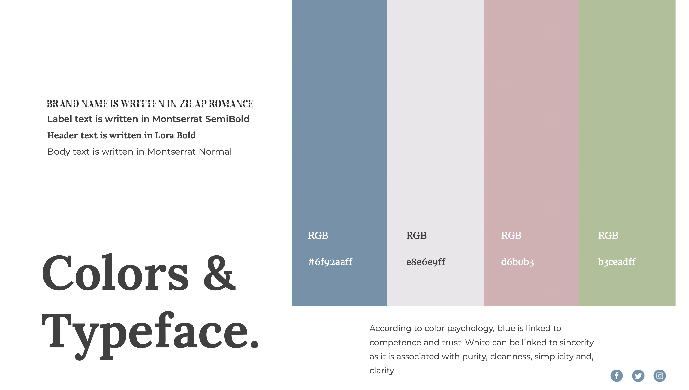
To ensure the sub-brand is identifiable and differentiable, a visual identity was developed with the six criteria from Kotler & Keller in mind. For example, the new product fits in a healthy lifestyle instead of disrupting it. Subsequently, the name ‘Flow’ comes from the expression “go with the flow”. Another example is the playful yet minimalistic, handcrafted pattern that I designed for the labels. It simulates a flowing feeling and, in turn, strengthens the associations with the brand name. The white, blue and green colours of the brand elements are based on color psychology and the recognisability of the Heineken brand.
All elements of the strategy work together to provide the positioning of a healthier alternative to your average beer. Something people are still able to enjoy greatly, but also enables them to mind their calorie intake and health in the process.
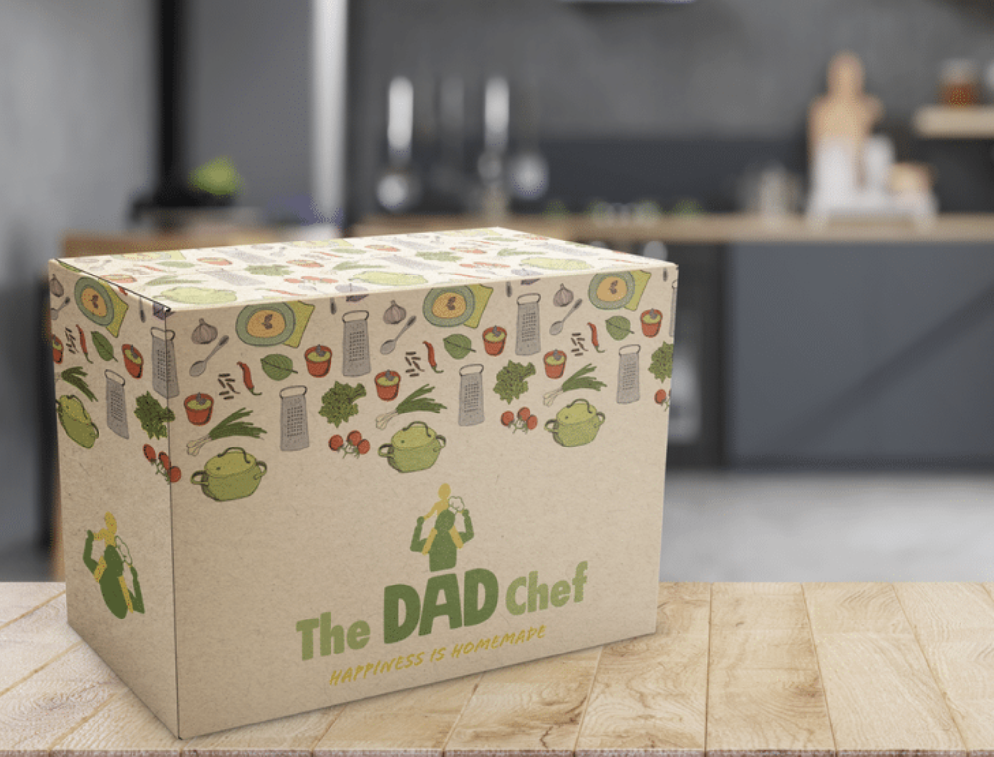

The Dad Chef
Consumer Insights · Branding · Social Media · Advertising · Adobe Photoshop
The Dad Chef is a brand my teammates and I designed for the fictional brand 'The King's Company'. The King’s Company is trying to sell cooking courses for stay-at-home dads who have decided to change their lifestyle as a result of the Covid-19 crisis. The case challenged us to create a comprehensive marketing communications plan.
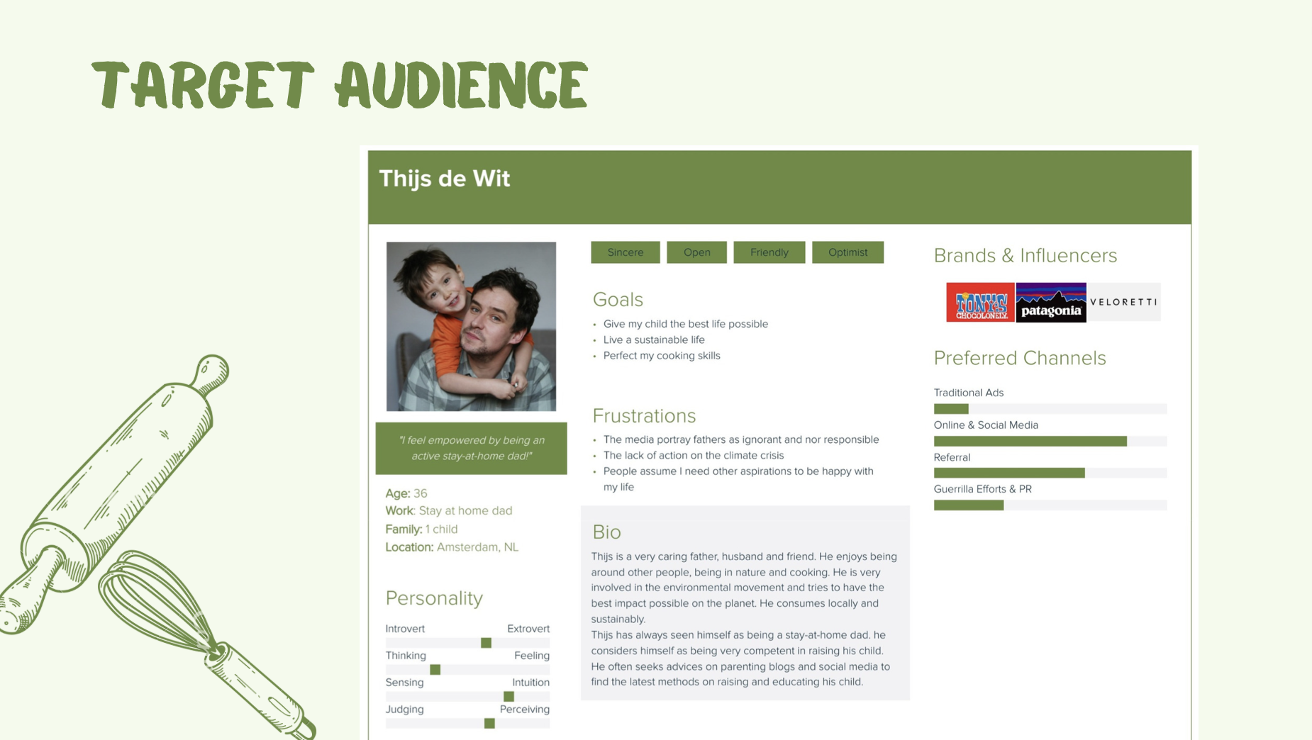
Our target audience consists of Dutch Millennial dads with an upper-middle to high income, as these families have the financial liberty to have only one breadwinner. The dads do not agree with the social construct that the man has to be the breadwinner. Moreover, they are concerned with the environment and are likely to pay more for eco-friendly products.
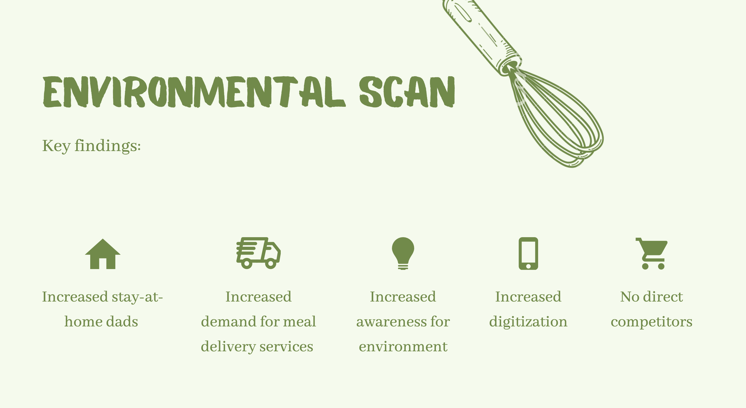
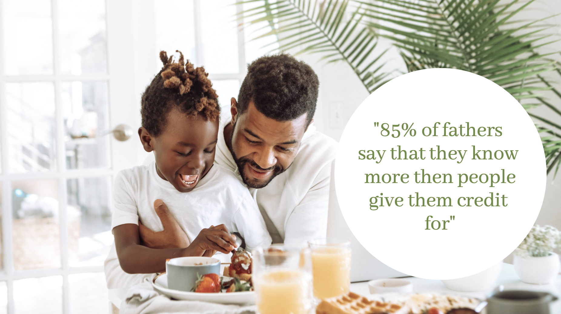
After making a persona, we did a DESTEP analysis, interviewed a single father and used the research of MDG Advertising to gain insight in the worlds of these dads. A few interesting findings include the large increase in stay-at-home dads due to remote working; an increased demand in delivery services; an increased awareness for the environment and increased digitisation. An especially interesting finding was that 85% of fathers say that they know more than people give them credit for, and 75% of Millennial dads believe that advertisers and marketers are out of touch with modern family dynamics. This is something we could work with in our advertising to connect with these fathers. Hence, the key message in our communication became to challenge the misconception that fathers do not know what they are doing.
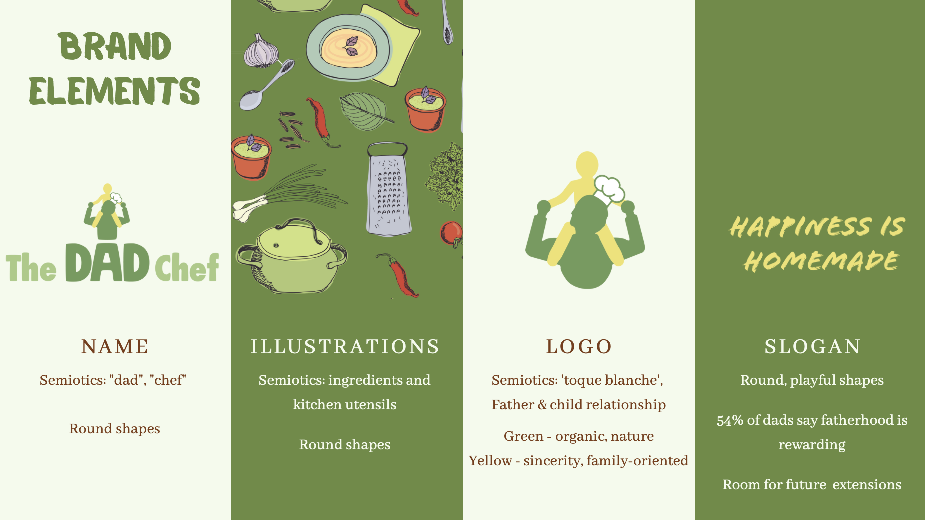
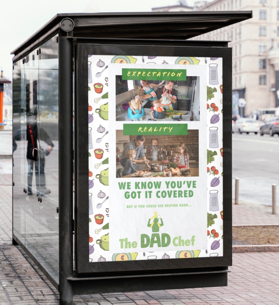
The Dad Chef offers eco-friendly mealboxes accompanied with live cooking courses for every level of experience. The name and design of the brand is based on semiotic theory. The slogan “Happiness is homemade” conveys the strong message that dads have a crucial role in the home and that their cooking contributes to its happiness. Yet, it still provides enough room for future brand extensions.
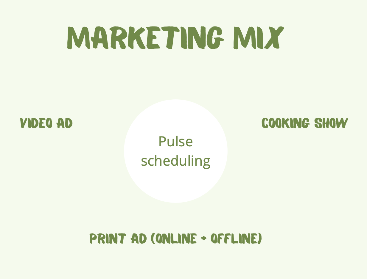
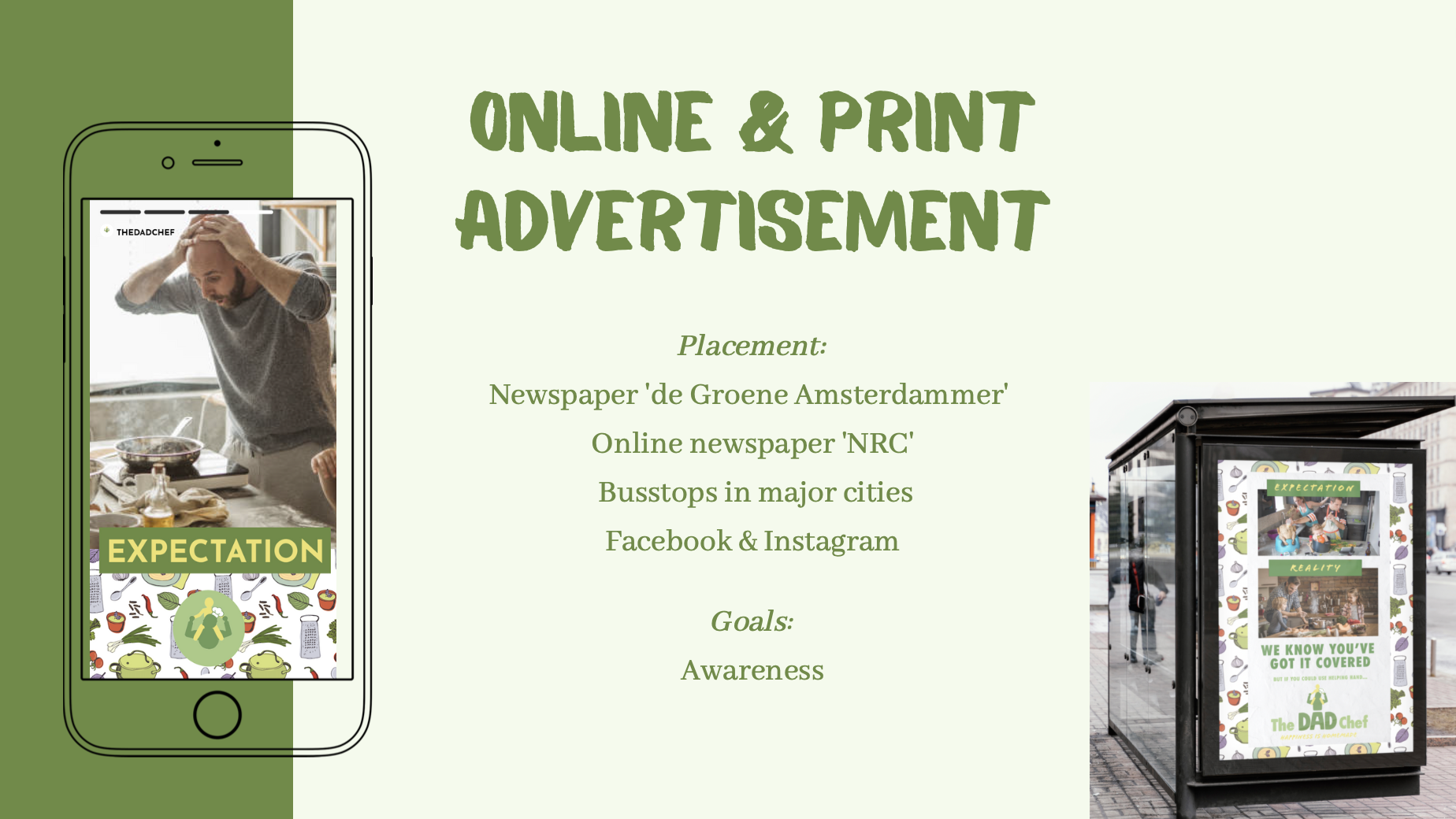
All communications have the core idea of the “expectation versus reality”. Multiple communication tools were used, for example a video ad and a collaboration with ‘Heel Holland Bakt’. In the video advertisement, several videos of the same father in diverse home situations are shown. In the first shot, the father is portrayed as not knowing what he is doing - the expectation. The second shot is him doing this chore flawlessly - the reality.
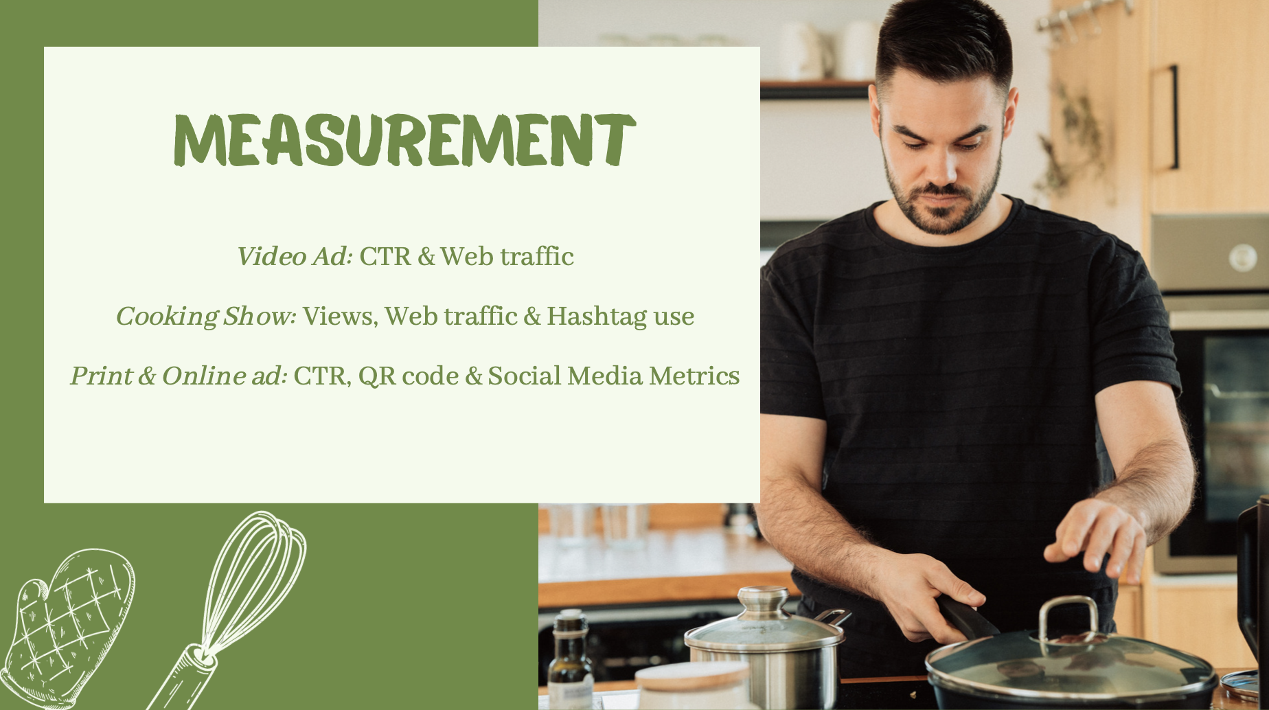
The measurement of the campaign will be closely monitored using the CTR, engagement numbers, web-traffic and Google searches to measure the passive tv and print advertisements.
For the full presentation, click here